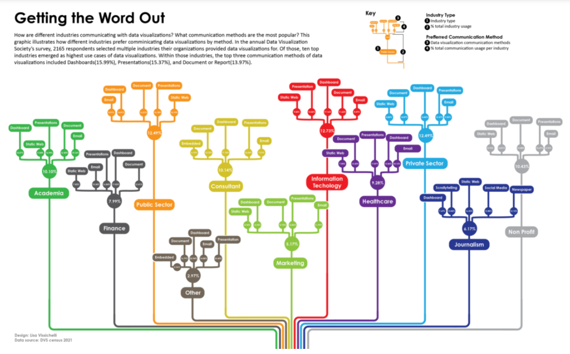
Data visualizations are gaining popularity and industries are demanding a wider range of ways to get the word out. This year’s DVS census shows that industries are evolving how they share data visualizations. Of the top three communication methods, Dashboards, Presentations and Document or Report emerged as the highest use cases. This graphic illustrates how industries prefer communicating data visualizations by method.
Top 25 honorable mentions
Selected as a top 25 winner of this year’s DVS survey challenge using the Annual State of the Industry Survey data, an annual exploration of the data visualization landscape.